In this post, we are creating a multi-layer neural network that consists of more than one layer to extract the underlying patterns in the training data. This multilayer neural network will work like a regressor. We are going to generate some data points based on the equation: 𝒚= 𝟐𝑿𝟐+𝟖.
Import the necessary packages as shown:
import matplotlib.pyplot as plt
import neurolab as nl
Generate some data point based on the above mentioned equation:
min_val = -30
max_val = 30num_points = 160
x = np.linspace(min_val, max_val, num_points)
y = 2 * np.square(x) + 8
y /= np.linalg.norm(y)
Now, reshape this data set as follows:
data = x.reshape(num_points, 1)
labels = y.reshape(num_points, 1)
labels = y.reshape(num_points, 1)
Visualize and plot the input data set using the following commands:
plt.figure()
plt.scatter(data, labels)
plt.xlabel('Dimension 1')
plt.ylabel('Dimension 2')
plt.title('Data-points')
plt.scatter(data, labels)
plt.xlabel('Dimension 1')
plt.ylabel('Dimension 2')
plt.title('Data-points')
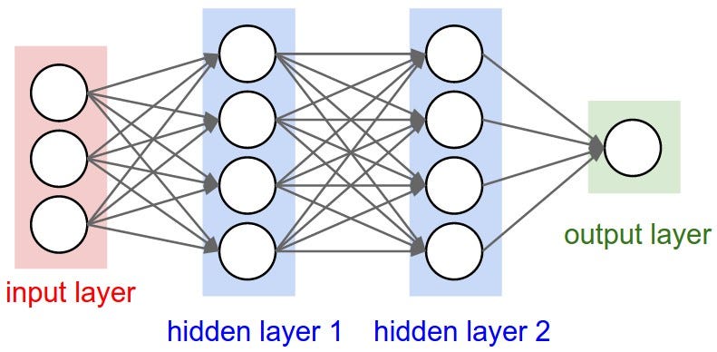
Now, build the neural network having two hidden layers with neurolab with ten neurons in the first hidden layer, six in the second hidden layer and one in the output layer.
neural_net = nl.net.newff([[min_val, max_val]], [10, 6, 1])
Now use the gradient training algorithm:
neural_net.trainf = nl.train.train_gd
Now train the network with goal of learning on the data generated above:
error = neural_net.train(data, labels, epochs=1000, show=100, goal=0.01)
Now, run the neural networks on the training data-points:
output = neural_net.sim(data)
y_pred = output.reshape(num_points)
y_pred = output.reshape(num_points)
Now plot and visualization task:
plt.figure()
plt.plot(error)
plt.xlabel('Number of epochs')
plt.ylabel('Error')
plt.title('Training error progress')
plt.plot(error)
plt.xlabel('Number of epochs')
plt.ylabel('Error')
plt.title('Training error progress')
Now we will be plotting the actual versus predicted output:
x_dense = np.linspace(min_val, max_val, num_points * 2)
y_dense_pred=neural_net.sim(x_dense.reshape(x_dense.size,1)).reshape(x_dense.size)
plt.figure()
plt.plot(x_dense, y_dense_pred, '-', x, y, '.', x, y_pred, 'p')
plt.title('Actual vs predicted')
plt.show()
y_dense_pred=neural_net.sim(x_dense.reshape(x_dense.size,1)).reshape(x_dense.size)
plt.figure()
plt.plot(x_dense, y_dense_pred, '-', x, y, '.', x, y_pred, 'p')
plt.title('Actual vs predicted')
plt.show()
As a result of the above commands, you can observe the graphs as shown below:


In the next post we'll start with the concepts reinforcement learning in AI with Python.
0 comments:
Post a Comment