Sunday, May 26, 2019

Pandas - 44 Supervised Learning with scikit-learn (Support Vector Machines)

The Support Vector Machines (SVM) classifiers are binary or discriminating models, working on two classes of differentiation. Their main task is basically to discriminate against new observations between two classes. During the learning phase, these classifiers project the observations in a multidimensional space called decisional space and build a separation surface called the decision boundary that divides this space into two areas of belonging.

In the simplest case such as the linear case, the decision boundary will be represented by a plane (in 3D) or by a straight line (in 2D). In more complex cases, the separation surfaces are curved shapes with increasingly articulated shapes.

The SVM can be used both in regression with the SVR (Support Vector Regression) and in classification with the SVC (Support Vector Classification).

Support Vector Classification (SVC)

To understand how this algorithm works, we'll start by referring to the simplest case, that is the linear 2D case, where the decision boundary will be a straight line separating into two parts the decisional area. Take for example a simple training set where some points are assigned to two different classes.

The training set will consist of 11 points (observations) with two different attributes that will have values between 0 and 4. These values will be contained within a NumPy array called x. Their belonging to one of two classes will be defined by 0 or 1 values contained in another array called y.
Visualize distribution of these points in space with a scatterplot which will then be defined as a decision space. See the following program :

from sklearn import svm

x = np.array([[1,3],[1,2],[1,1.5],[1.5,2],[2,3],[2.5,1.5],[2,1],[3,1],[3,2],[3.5,1],[3.5,3]])
y = [0]*6 + [1]*5
plt.scatter(x[:,0],x[:,1],c=y,s=50,alpha=0.9)
plt.show()


The output of the program is shown below: 
After defining the training set we can apply the SVC (Support Vector Classification) algorithm. This algorithm will create a line (decision boundary) in order to divide the decision area into two parts and this straight line will be placed so as to maximize its distance of closest observations contained in the training set. This condition should produce two different portions in which all points of a same class should be contained.

Next we apply the SVC algorithm to the training set and to do so, first we define the model with the SVC() constructor defining the kernel as linear. (A kernel is a class of algorithms for pattern analysis.) Then we will use the fit() function with the training set as an argument. Once the model is trained we can plot the decision boundary with the decision_function() function. Then we draw the scatterplot and provide a different color to the two portions of the decision space. See the following program :

x = np.array([[1,3],[1,2],[1,1.5],[1.5,2],[2,3],[2.5,1.5],[2,1],[3,1],[3,2],[3.5,1],[3.5,3]])
y = [0]*6 + [1]*5
svc = svm.SVC(kernel='linear').fit(x,y)
X,Y = np.mgrid[0:4:200j,0:4:200j]
Z = svc.decision_function(np.c_[X.ravel(),Y.ravel()])
Z = Z.reshape(X.shape)
plt.contourf(X,Y,Z > 0,alpha=0.4)
plt.contour(X,Y,Z,colors=['k'], linestyles=['-'],levels=[0])
plt.scatter(x[:,0],x[:,1],c=y,s=50,alpha=0.9)
plt.show()


The output of the program shows the two portions containing the two classes. It can be said that the division is successful except for a purple dot in the yellow portion.:
Thus once the model has been trained, it is simple to understand how the predictions operate. Graphically, depending on the position occupied by the new observation, we will know its corresponding membership in one of the two classes. Instead, from a more programmatic point of view, the predict() function will return the number of the corresponding class of belonging (0 for class in purple, 1 for the class in yellow). Thus if we add these lines to the above program:

print(svc.predict([[1.5,2.5]]))
print(svc.predict([[2.5,1]]))


We get the out put as [0] [1].

Regularization

A related concept with the SVC algorithm is regularization. It is set by the parameter C: a small value of C means that the margin is calculated using many or all of the observations around the line of separation (greater regularization), while a large value of C means that the margin is calculated on the observations near to the line separation (lower regularization). Unless otherwise specified, the default value of C is equal to 1. See the following program:

x = np.array([[1,3],[1,2],[1,1.5],[1.5,2],[2,3],[2.5,1.5],[2,1],[3,1],[3,2],[3.5,1],[3.5,3]])
y = [0]*6 + [1]*5
svc = svm.SVC(kernel='linear',C=1).fit(x,y)
X,Y = np.mgrid[0:4:200j,0:4:200j]
Z = svc.decision_function(np.c_[X.ravel(),Y.ravel()])
Z = Z.reshape(X.shape)
plt.contourf(X,Y,Z > 0,alpha=0.4)
plt.contour(X,Y,Z,colors=['k','k','k'], linestyles=['--','-','--'],
levels=[-1,0,1])
plt.scatter(svc.support_vectors_[:,0],svc.support_vectors_[:,1],s=120,facecolors='r')
plt.scatter(x[:,0],x[:,1],c=y,s=50,alpha=0.9)

plt.show()

The output of the program is shown below:
We can highlight points that participated in the margin calculation, identifying them through the support_vectors array. These points are represented by rimmed circles in the scatterplot. Furthermore, they will be within an evaluation area in the vicinity of the separation line (see the dashed
lines in the output figure).

In order to see the effect on the decision boundary, we can restrict the value to C = 0.1. Let’s
see how many points will be taken into consideration with the help of following program in which we'll only change C from 1 to 0.1:

x = np.array([[1,3],[1,2],[1,1.5],[1.5,2],[2,3],[2.5,1.5],[2,1],[3,1],[3,2],[3.5,1],[3.5,3]])
y = [0]*6 + [1]*5
svc = svm.SVC(kernel='linear',C=0.1).fit(x,y)
X,Y = np.mgrid[0:4:200j,0:4:200j]
Z = svc.decision_function(np.c_[X.ravel(),Y.ravel()])
Z = Z.reshape(X.shape)
plt.contourf(X,Y,Z > 0,alpha=0.4)
plt.contour(X,Y,Z,colors=['k','k','k'], linestyles=['--','-','--'],
levels=[-1,0,1])
plt.scatter(svc.support_vectors_[:,0],svc.support_vectors_[:,1],s=120,facecolors='r')
plt.scatter(x[:,0],x[:,1],c=y,s=50,alpha=0.9)

plt.show()


The output of the program is shown below which shows that the points taken into consideration are increased and consequently the separation line (decision boundary) has changed orientation. Also there are two points now that are in the wrong decision areas:


Here I am ending today’s post. Until we meet again keep practicing and learning Python, as Python is easy to learn!
Share:

Thursday, May 23, 2019

Pandas - 43 Supervised Learning with scikit-learn (Linear Regression)


Linear Regression uses data contained in the training set to build a linear model. The most simple is based on the equation of a rect with the two parameters a and b to characterize it. These parameters will be calculated so as to make the sum of squared residuals as small as possible.

y = a*x + c

In this expression, x is the training set, y is the target, b is the slope, and c is the intercept of the rect represented by the model. In scikit-learn, to use the predictive model for the linear regression, we  must import the linear_model module and then use the manufacturer LinearRegression() constructor to create the predictive model, which we call linreg.

In the following program we'll use the diabetes dataset described in the previous post:

linreg = linear_model.LinearRegression()

diabetes = datasets.load_diabetes()
# break the 442 patients into a training set
x_train = diabetes.data[:-20]
y_train = diabetes.target[:-20]
# break the 442 patients into a test set
x_test = diabetes.data[-20:]
y_test = diabetes.target[-20:]

linreg.fit(x_train,y_train)#apply the training set to the predictive model
print('\n10 b coefficients\n')
print(linreg.coef_)#get the 10 b coefficients
print('\nA series of targets to be compared with the values actually observed\n')
print(linreg.predict(x_test))#apply the test set to the linreg prediction model
print(y_test)
print('\nVariance\n')
print(linreg.score(x_test, y_test))#Calculating the variance


In our program we first break the 442 patients into a training set (composed of the first 422 patients) and a test set (the last 20 patients). Next we apply the training set to the predictive model through the use of the fit() function. Once the model is trained we can get the 10 b coefficients calculated for each physiological variable, using the coef_ attribute of the predictive model.

Later we apply the test set to the linreg prediction model to get a series of targets to be compared with the values actually observed. Finally we calculate the variance which is a good indicator of what prediction should be perfect. Ideally, the closer the variance is to 1, the more perfect the prediction.

The output of the program is shown below:

10 b coefficients

[ 3.03499549e-01 -2.37639315e+02  5.10530605e+02  3.27736980e+02
 -8.14131709e+02  4.92814588e+02  1.02848452e+02  1.84606489e+02
  7.43519617e+02  7.60951722e+01]

A series of targets to be compared with the values actually observed

[197.61846908 155.43979328 172.88665147 111.53537279 164.80054784
 131.06954875 259.12237761 100.47935157 117.0601052  124.30503555
 218.36632793  61.19831284 132.25046751 120.3332925   52.54458691
 194.03798088 102.57139702 123.56604987 211.0346317   52.60335674]
[233.  91. 111. 152. 120.  67. 310.  94. 183.  66. 173.  72.  49.  64.
  48. 178. 104. 132. 220.  57.]

Variance

0.5850753022690571
------------------
(program exited with code: 0)

Press any key to continue . . .


Now let's start with the linear regression, taking into account a single physiological factor, the age. See the following program :

diabetes = datasets.load_diabetes()
x_train = diabetes.data[:-20]
y_train = diabetes.target[:-20]
x_test = diabetes.data[-20:]
y_test = diabetes.target[-20:]
x0_test = x_test[:,0]
x0_train = x_train[:,0]
x0_test = x0_test[:,np.newaxis]
x0_train = x0_train[:,np.newaxis]
linreg = linear_model.LinearRegression()
linreg.fit(x0_train,y_train)
y = linreg.predict(x0_test)
plt.scatter(x0_test,y_test,color='k')
plt.plot(x0_test,y,color='b',linewidth=3)
plt.show()


The output of the program is shown below where the blue line representing the linear correlation between the ages of patients and the disease progression:
We have 10 physiological factors within the diabetes dataset. Therefore, to have a more complete picture of all the training set, we can make a linear regression for every physiological feature, creating 10 models and seeing the result for each of them through a linear chart.

See the following program :

diabetes = datasets.load_diabetes()
x_train = diabetes.data[:-20]
y_train = diabetes.target[:-20]
x_test = diabetes.data[-20:]
y_test = diabetes.target[-20:]
plt.figure(figsize=(8,12))

linreg = linear_model.LinearRegression()

for f in range(0,10):
    xi_test = x_test[:,f]
    xi_train = x_train[:,f]
    xi_test = xi_test[:,np.newaxis]
   
    xi_train = xi_train[:,np.newaxis]
    linreg.fit(xi_train,y_train)
    y = linreg.predict(xi_test)
    plt.subplot(5,2,f+1)
    plt.scatter(xi_test,y_test,color='k')
    plt.plot(xi_test,y,color='b',linewidth=3)
plt.show() 
   

The output of the program shows 10 linear charts, each of which represents the correlation between a
physiological factor and the progression of diabetes:
 

Here I am ending today’s post. Until we meet again keep practicing and learning Python, as Python is easy to learn!
Share:

Wednesday, May 22, 2019

Pandas - 42 Supervised Learning with scikit-learn (Diabetes Dataset)

The diabetes dataset is one of the various datasets available within the scikit-learn library. To upload the data contained in this dataset, first we have to import the datasets module of the scikit-learn library and then you call the load_diabetes() function to load the dataset into a variable that will be called diabetes.

from sklearn import datasets
diabetes = datasets.load_diabetes()


This dataset contains physiological data collected on 442 patients and as a corresponding
target an indicator of the disease progression after a year. The physiological data occupy
the first 10 columns with values that indicate respectively the following:

• Age
• Sex
• Body mass index
• Blood pressure
• S1, S2, S3, S4, S5, and S6 (six blood serum measurements)

These measurements can be obtained by calling the data attribute. But when we check the values in the dataset, we find values very different from what we expected. In the following program we look at the 10 values for the first patient:

from sklearn import datasets

diabetes = datasets.load_diabetes()
print(diabetes.data[0])


The output of the program is shown below:

[ 0.03807591  0.05068012  0.06169621  0.02187235 -0.0442235  -0.03482076
 -0.04340085 -0.00259226  0.01990842 -0.01764613]
------------------
(program exited with code: 0)

Press any key to continue . . . 


In the above output, each of the 10 values was mean centered and subsequently scaled by the standard deviation times the number of samples. Checking will reveal that the sum of squares of each column is equal to 1. Let's try doing this calculation with the age measurements; we should obtain a value very close to 1. See the following program :

diabetes = datasets.load_diabetes()
print(np.sum(diabetes.data[:,0]**2))


The output of the program is shown below:

1.0000000000000746
------------------
(program exited with code: 0)

Press any key to continue . . . 


Even though these values are normalized and therefore difficult to read, they continue to express the 10 physiological characteristics and therefore have not lost their value or statistical information.

As for the indicators of the progress of the disease, that is, the values that must correspond to the results of our predictions, these are obtainable by means of the target attribute as shown in the following program :

diabetes = datasets.load_diabetes()
print(diabetes.target)


The output of the program is shown below:

[151.  75. 141. 206. 135.  97. 138.  63. 110. 310. 101.  69. 179. 185.
 118. 171. 166. 144.  97. 168.  68.  49.  68. 245. 184. 202. 137.  85.
 131. 283. 129.  59. 341.  87.  65. 102. 265. 276. 252.  90. 100.  55.
.......

....... 
72. 140. 189. 181. 209. 136. 261. 113. 131. 174. 257.  55.  84.  42.
 146. 212. 233.  91. 111. 152. 120.  67. 310.  94. 183.  66. 173.  72.
  49.  64.  48. 178. 104. 132. 220.  57.]
------------------
(program exited with code: 0)

Press any key to continue . . .


Here I am ending today’s post. Until we meet again keep practicing and learning Python, as Python is easy to learn!
Share:

Tuesday, May 21, 2019

Pandas - 41 Supervised Learning with scikit-learn (classification using K-Nearest Neighbors Classifier)

To perform a classification, and to do this operation with the scikit-learn library we need a classifier. Given a new measurement of an iris flower, the task of the classifier is to figure out to which of the three species it belongs. The simplest possible classifier is the nearest neighbor. This algorithm will search within the training set for the observation that most closely approaches the new test sample.

We have only a single dataset of data and we should'nt use the same data both for the test and for the training. In this regard, the elements of the dataset are divided into two parts, one dedicated to train the algorithm and the other to perform its validation.

Thus, before proceeding further we'll divide our Iris Dataset into two parts. It is wise to randomly mix the array elements and then make the division. In fact, often the data may have been collected in a particular order, and in our case the Iris Dataset contains items sorted by species. So to make a blending of elements of the dataset we will use a NumPy function called random.permutation(). The mixed dataset consists of 150 different observations; the first 140 will be used as the training set, the
remaining 10 as the test set. See the following program :

np.random.seed(0)
iris = datasets.load_iris()
x = iris.data
y = iris.target
i = np.random.permutation(len(iris.data))
x_train = x[i[:-10]]
y_train = y[i[:-10]]
x_test = x[i[-10:]]
y_test = y[i[-10:]]


Now that we have divided our Iris Dataset into two parts we can apply the K-Nearest Neighbor algorithm. Import the KNeighborsClassifier, call the constructor of the classifier, and then train it with the fit() function. See the following program :

from sklearn.neighbors import KNeighborsClassifier
np.random.seed(0)
iris = datasets.load_iris()
x = iris.data
y = iris.target
i = np.random.permutation(len(iris.data))
x_train = x[i[:-10]]
y_train = y[i[:-10]]
x_test = x[i[-10:]]
y_test = y[i[-10:]]

knn = KNeighborsClassifier()
knn.fit(x_train,y_train)


Now that we have a predictive model that consists of the knn classifier, trained by 140 observations, we will find out how it is valid. The classifier should correctly predict the species of iris of the 10 observations of the test set. In order to obtain the prediction we have to use the predict() function, which will be applied directly to the predictive model, knn. Finally, we will compare the results predicted with the actual observed contained in y_test.

np.random.seed(0)
iris = datasets.load_iris()
x = iris.data
y = iris.target
i = np.random.permutation(len(iris.data))
x_train = x[i[:-10]]
y_train = y[i[:-10]]
x_test = x[i[-10:]]
y_test = y[i[-10:]]

knn = KNeighborsClassifier()
knn.fit(x_train,y_train)
print(knn.predict(x_test))
print(y_test)


The output of the program is shown below:

[1 2 1 0 0 0 2 1 2 0]
[1 1 1 0 0 0 2 1 2 0]
------------------
(program exited with code: 0)

Press any key to continue . . .


The output shows that we obtained a 10% error. Now we can visualize all this using decision boundaries in a space represented by the 2D scatterplot of sepals. See the following program :

iris = datasets.load_iris()
x = iris.data[:,:2] #X-Axis - sepal lenght-width
y = iris.target     #Y-Axis - species

x_min, x_max = x[:,0].min() - .5, x[:,0].max() + .5
y_min, y_max = x[:,1].min() - .5, x[:,1].max() + .5

#MESH
cmap_light = ListedColormap(['#AAAAFF','#AAFFAA','#FFAAAA'])
h = .02
xx, yy = np.meshgrid(np.arange(x_min, x_max, h), np.arange(y_min, y_max, h))
knn = KNeighborsClassifier()
knn.fit(x,y)
Z = knn.predict(np.c_[xx.ravel(),yy.ravel()])
Z = Z.reshape(xx.shape)

plt.figure()
plt.pcolormesh(xx,yy,Z,cmap=cmap_light)

#Plot the training points
plt.scatter(x[:,0],x[:,1],c=y)
plt.xlim(xx.min(),xx.max())
plt.ylim(yy.min(),yy.max())
plt.show()


The output of the program is a subdivision of the scatterplot in decision boundaries as shown below :
Let's do the same thing considering the size of the petals. See the following program :

iris = datasets.load_iris()
x = iris.data[:,2:4] #X-Axis - petal lenght-width
y = iris.target     #Y-Axis - species

x_min, x_max = x[:,0].min() - .5, x[:,0].max() + .5
y_min, y_max = x[:,1].min() - .5, x[:,1].max() + .5

#MESH
cmap_light = ListedColormap(['#AAAAFF','#AAFFAA','#FFAAAA'])
h = .02
xx, yy = np.meshgrid(np.arange(x_min, x_max, h), np.arange(y_min, y_max, h))
knn = KNeighborsClassifier()
knn.fit(x,y)
Z = knn.predict(np.c_[xx.ravel(),yy.ravel()])
Z = Z.reshape(xx.shape)

plt.figure()
plt.pcolormesh(xx,yy,Z,cmap=cmap_light)

#Plot the training points
plt.scatter(x[:,0],x[:,1],c=y)
plt.xlim(xx.min(),xx.max())
plt.ylim(yy.min(),yy.max())
plt.show()


The output of the program is shown below: 
 
Here I am ending today’s post. In the next post we'll discuss about the diabetes dataset. Until we meet again keep practicing and learning Python, as Python is easy to learn!
Share:

Monday, May 20, 2019

Pandas - 40 Supervised Learning with scikit-learn

Supervised learning consists of learning possible patterns between two or more features reading values from a training set; the learning is possible because the training set contains known results (target or labels). All models in scikit-learn are referred to as supervised estimators, using the fit(x, y) function that makes their training.

x comprises the features observed, while y indicates the target. Once the estimator has carried out the training, it will be able to predict the value of y for any new observation x not labeled. This operation will make it through the predict(x) function.

Some classic examples of supervised learning are:

• Classification, using the Iris Dataset
   • K-Nearest Neighbors Classifier
   • Support Vector Machines (SVC)

• Regression, using the Diabetes Dataset
   • Linear Regression
   • Support Vector Machines (SVR)

Let's first discuss about The Iris Flower Dataset:

The Iris Flower Dataset is a particular dataset used for the first time by Sir Ronald Fisher in 1936. It is often also called Anderson Iris Dataset, after the person who collected the data directly measuring the size of the various parts of the iris flowers. In this dataset, data from three different species of iris (Iris silky, virginica Iris, and Iris versicolor) are collected and these data correspond to the length and width of the sepals and the length and width of the petals. The figure below shows the Iris versicolor and the petal and sepal width and length


This dataset is currently being used as a good example for many types of analysis, in particular for the problems of classification, which can be approached by means of machine learning methodologies. It is no coincidence then that this dataset is provided along with the scikit-learn library as a 150x4 NumPy array. To use the datasets we need to import them into our program:

from sklearn import datasets

Also we need to install scikit -learn using pip install -U scikit -learn. The following program will get an array of elements, the size of sepals and petals respectively:

from sklearn import datasets

iris = datasets.load_iris()
print(iris.data)


The output of the program is shown below:

2018-12-27 00:00:00
2018-12-27 16:29:00
[[5.1 3.5 1.4 0.2]
 [4.9 3.  1.4 0.2]
 [4.7 3.2 1.3 0.2]
 [4.6 3.1 1.5 0.2]
 [5.  3.6 1.4 0.2]
:

:
 [6.5 3.  5.2 2. ]
 [6.2 3.4 5.4 2.3]
 [5.9 3.  5.1 1.8]]
------------------
(program exited with code: 0)

Press any key to continue . . .


As a result we get an array of 150 elements, each containing four numeric values: the size of sepals and petals respectively. Using the target attribute we can know what kind of flower belongs each item. To know the correspondence between the species and number, we have to call the target_names attribute. See the following program :

iris = datasets.load_iris()
print(iris.data)
print("\nWhat kind of flower belongs each item\n")
print(iris.target)
print("\nWhat kind of correspondence between the species and number\n")
print(iris.target_names)


The output of the program is shown below:

2018-12-27 00:00:00
2018-12-27 16:29:00
[[5.1 3.5 1.4 0.2]
 [4.9 3.  1.4 0.2]
 [4.7 3.2 1.3 0.2]
 [4.6 3.1 1.5 0.2]
:

:
 [6.2 3.4 5.4 2.3]
 [5.9 3.  5.1 1.8]]

What kind of flower belongs each item

[0 0 0 0 0 0 0 0 0 0 0 0 0 0 0 0 0 0 0 0 0 0 0 0 0 0 0 0 0 0 0 0 0 0 0 0 0
 0 0 0 0 0 0 0 0 0 0 0 0 0 1 1 1 1 1 1 1 1 1 1 1 1 1 1 1 1 1 1 1 1 1 1 1 1
 1 1 1 1 1 1 1 1 1 1 1 1 1 1 1 1 1 1 1 1 1 1 1 1 1 1 2 2 2 2 2 2 2 2 2 2 2
 2 2 2 2 2 2 2 2 2 2 2 2 2 2 2 2 2 2 2 2 2 2 2 2 2 2 2 2 2 2 2 2 2 2 2 2 2
 2 2]

What kind of correspondence between the species and number

['setosa' 'versicolor' 'virginica']
------------------
(program exited with code: 0)

Press any key to continue . . .


We obtain 150 items with three possible integer values (0, 1, and 2), which correspond to the three species of iris.

Now to better understand this dataset we'll  use the matplotlib library, using the techniques we  learned in previous posts. We  create a scatterplot that displays the three different species in three different colors. The x-axis will represent the length of the sepal while the y-axis will represent the width of the sepal. See the following program :

iris = datasets.load_iris()
print(iris.data)
x = iris.data[:,0] #X-Axis - sepal length
y = iris.data[:,1] #Y-Axis - sepal length

species = iris.target #Species
x_min, x_max = x.min() - .5,x.max() + .5
y_min, y_max = y.min() - .5,y.max() + .5

#SCATTERPLOT
plt.figure()
plt.title('Iris Dataset - Classification By Sepal Size')
plt.scatter(x,y, c=species)
plt.xlabel('Sepal length')
plt.ylabel('Sepal width')
plt.xlim(x_min, x_max)
plt.ylim(y_min, y_max)
plt.xticks(())
plt.yticks(())
plt.show()


The output of the program is shown below which is the scatterplot:

The purple ones are the Iris setosa, flowers, green ones are the Iris versicolor, and yellow ones are the Iris virginica. We can see how the Iris setosa features differ from the other two, forming a cluster of blue dots separate from the others.

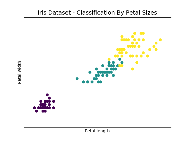
Now let's follow the same procedure, but this time using the other two variables, that is the measure of the length and width of the petal. See the following program :

iris = datasets.load_iris()
x = iris.data[:,2] #X-Axis - petal lenght
y = iris.data[:,3] #Y-Axis - petal width
species = iris.target #species

x_min, x_max = x.min() - .5, x.max() + .5
y_min, y_max = y.min() - .5, y.max() + .5

#SCATTERPLOT
plt.figure()
plt.title('Iris Dataset - Classification By Petal Sizes', size = 14)
plt.scatter(x,y, c=species)
plt.xlabel('Petal length')
plt.ylabel('Petal width')
plt.xlim(x_min, x_max)
plt.ylim(y_min, y_max)
plt.xticks(())
plt.yticks(())
plt.show()


The output scatterplot is shown below:

In this case the division between the three species is much more evident. We have three different clusters. We represented two scatterplots, one for the petals and one for sepals, but how we can unify the whole thing? Four dimensions are a problem that even a Scatterplot 3D is not able to solve. In this regard a special technique called Principal Component Analysis (PCA) has been developed.

The PCA Decomposition

This technique allows to reduce the number of dimensions of a system keeping all the information for the characterization of the various points, the new dimensions generated are called principal components. In our case, we can reduce the system from four to three dimensions and then plot the results within a 3D scatterplot. In this way we can use measures both of sepals and of petals for
characterizing the various species of iris of the test elements in the dataset.

The scikit-learn function that allows us to do the dimensional reduction is the fit_transform() function. It belongs to the PCA object. In order to use it, first we need to import the PCA sklearn.decomposition module. Then we have to define the object constructor using PCA() and define the number of new dimensions (principal components) as a value of the n_components option. In our case, it is 3. Finally we have to call the fit_transform() function by passing the four-dimensional Iris Dataset as an argument. See the following program :

iris = datasets.load_iris()
#x = iris.data[:,1] #X-Axis - sepal width
#y = iris.data[:,2] #Y-Axis - petal lenght
species = iris.target #species
x_reduced = PCA(n_components=3).fit_transform(iris.data)

#SCATTERPLOT 3D
fig = plt.figure()
ax = Axes3D(fig)
ax.set_title('Iris Dataset by PCA', size = 14)
ax.scatter(x_reduced[:,0],x_reduced[:,1],x_reduced[:,2], c=species)
ax.set_xlabel('First eigenvector')
ax.set_ylabel('Second eigenvector')
ax.set_zlabel('Third eigenvector')
ax.w_xaxis.set_ticklabels(())
ax.w_yaxis.set_ticklabels(())
ax.w_zaxis.set_ticklabels(())
plt.show()


The output scatterplot is shown below:


In order to visualize the new values you will use a scatterplot 3D using the mpl_toolkits.mplot3d module of matplotlib. The three species of iris are well characterized with respect to each other to form a cluster.

Here I am ending today’s post. In the next post we will perform a classification using K-Nearest Neighbors Classifier.  Until we meet again keep practicing and learning Python, as Python is easy to learn!
Share: